Color Aware: Difference between revisions
No edit summary |
No edit summary |
||
| (9 intermediate revisions by the same user not shown) | |||
| Line 1: | Line 1: | ||
==How to Use Color Aware Luminance Mode== | ==How to Use Color Aware Luminance Mode== | ||
[https://www.youtube.com/watch?v=syWcvZ2pxIg&pp=ygUIaHVlZm9yZ2U%3D| Color Aware Video tutorial] | |||
*Note: This article updated to show the version 0.8 user interface, but the fundamental techniques have not changed. | |||
As with Color Pop, Color Aware is sometimes the best way to get the needed color separation that a project demands. This can be the case when the image contains two or three dominate colors but few grey scale areas. Like Color Pop, Color Aware reproduces the color spectrum multiple times one on top of the other. | As with Color Pop, Color Aware is sometimes the best way to get the needed color separation that a project demands. This can be the case when the image contains two or three dominate colors but few grey scale areas. Like Color Pop, Color Aware reproduces the color spectrum multiple times one on top of the other. | ||
| Line 9: | Line 13: | ||
As with the Color Pop mode discussed in another article, a good way to learn this mode is to start with one of the premade examples provided in the HueForge/Projects folder. But rather than load the project, just the image used in the project is loaded with the default settings. For example, load the Color_Aware_Test.png file from the Projects folder. | As with the Color Pop mode discussed in another article, a good way to learn this mode is to start with one of the premade examples provided in the HueForge/Projects folder. But rather than load the project, just the image used in the project is loaded with the default settings. For example, load the Color_Aware_Test.png file from the Projects folder. | ||
[[File: | [[File:Screenshot 2024-11-19 112716.png|thumb|750px|center|Figure 1]] | ||
Just to prove the point, let’s try to color the picture in Standard mode. The major color scheme appears to be brown (which lands in the red spectrum), yellow and green. | Just to prove the point, let’s try to color the picture in Standard mode. The major color scheme appears to be brown (which lands in the red spectrum), yellow and green. | ||
[[File: | [[File:Screenshot_2024-11-19_113653.png|thumb|750px|center|Figure 2]] | ||
Clearly, the colors are not working. The cat’s nose, paw and ears and other places are not supposed to be green! This is what frustrates most first-time users when trying to add color to a HueForge design. Since it works primarily with the luminance (i.e. light intensity) of the image, areas with the same level of light are rendered as the same color in Standard mode, regardless of their actual color. And this is what the Color Aware Luminance mode helps to correct. | Clearly, the colors are not working. The cat’s nose, paw and ears and other places are not supposed to be green! This is what frustrates most first-time users when trying to add color to a HueForge design. Since it works primarily with the luminance (i.e. light intensity) of the image, areas with the same level of light are rendered as the same color in Standard mode, regardless of their actual color. And this is what the Color Aware Luminance mode helps to correct. | ||
| Line 21: | Line 25: | ||
Don’t be surprised at how bad it looks when selecting the Color Aware mode. That is because the sliders need major adjustment to conform to the new settings. It’s going to look something like this: | Don’t be surprised at how bad it looks when selecting the Color Aware mode. That is because the sliders need major adjustment to conform to the new settings. It’s going to look something like this: | ||
[[File: | [[File:Screenshot 2024-11-19 114222.png|thumb|750px|center|Figure 3]] | ||
Because the image contains mostly brown/red and green hues, the CA Presets is best changed as well to Red/Green. Then it should look like this: | Because the image contains mostly brown/red and green hues, the CA Presets is best changed as well to Red/Green. Then it should look like this: | ||
[[File: | [[File:Screenshot_2024-11-19_114657.png|thumb|750px|center|Figure 4]] | ||
There is a choice of how to proceed. One possibility is to replicate the default black and white colors onto additional sliders. This is easily done by clicking on the color box below the slider and dragging it to an unused slider. These new colors are used to define the added luminance regions of the design. The Color Core (circled in red) shows the color blending of the layers on the left and the extent of each color space on the right. | |||
*Note that the Color Core in version 0.8 is substantially enhanced from that of previous versions. The tags to the side of the core are equivalent to the sliders and can be used to change the layer by holding and moving them. In addition, filaments can be dragged from the library to the core. Pressing the space bar when hovering the cursor over these tags acts to disable the filament in the same way as clicking on the layer number box below the color's slider. | |||
However, HueForge provides an alternate approach that might simplify this step through a predefined Color Aware set of filaments/colors. It’s found in the pull-down menu (circled in yellow below) near the bottom of the filament library window, normally found at the left side of the HueForge window. | However, HueForge provides an alternate approach that might simplify this step through a predefined Color Aware set of filaments/colors. It’s found in the pull-down menu (circled in yellow below) near the bottom of the filament library window, normally found at the left side of the HueForge window. | ||
[[File: | [[File:Color_Aware_0.8_Fig_5.png|thumb|750px|center|Figure 5]] | ||
If the premade Color Aware set of filaments is chosen it loads the extra black and white filaments at the appropriate layers for three colors as well as a blue, a red and a green filament near the midpoint of their respective ranges. When selected, the image will look something like this. | If the premade Color Aware set of filaments is chosen it loads the extra black and white filaments at the appropriate layers for three colors as well as a blue, a red and a green filament near the midpoint of their respective ranges. When selected, the image will look something like this. | ||
[[File: | [[File:Screenshot_2024-11-19_130456.png|thumb|750px|center|Figure 6]] | ||
To limit it to just the red and green color domains, the sliders for the extra color domain need to be disabled and the levels of the remaining colors adjusted to more appropriate levels. However, be warned things will look much worse until all the adjustments are completed. | To limit it to just the red and green color domains, the sliders for the extra color domain need to be disabled and the levels of the remaining colors adjusted to more appropriate levels. However, be warned things will look much worse until all the adjustments are completed. | ||
| Line 41: | Line 47: | ||
After selecting the color aware premade filament set, change the CA Presets in the Model Geometry section to Red/Green. Then disable the second, third and fourth sliders (blue, white and black) and adjust the other silders to put the white at the top of the red domain just below the first black marker on the bar on the right side of the color core and the red filament slider to about midway between the lowest black and the first white. It should look something like this. | After selecting the color aware premade filament set, change the CA Presets in the Model Geometry section to Red/Green. Then disable the second, third and fourth sliders (blue, white and black) and adjust the other silders to put the white at the top of the red domain just below the first black marker on the bar on the right side of the color core and the red filament slider to about midway between the lowest black and the first white. It should look something like this. | ||
[[File: | [[File:Screenshot 2024-11-19 130942.png|thumb|750px|center|Figure 7]] | ||
With those in place add brown and yellow filaments to replace the blue and first white in the second and third sliders. With some tweaking (and reordering the sliders), it should now be possible to arrive at something like this: | With those in place add brown and yellow filaments to replace the blue and first white in the second and third sliders. With some tweaking (and reordering the sliders), it should now be possible to arrive at something like this: | ||
[[File: | [[File:Screenshot_2024-11-19_131905.png|thumb|750px|center|Figure 8]] | ||
That’s not bad! All the colors seem to be pretty much in the right places. From here it should be a matter of small adjustments to refine the design to suit your taste. | That’s not bad! All the colors seem to be pretty much in the right places. From here it should be a matter of small adjustments to refine the design to suit your taste. | ||
| Line 53: | Line 59: | ||
To make it easier, press the Reorder Sliders button to sort the sliders into ascending order from left to right. Then maybe try changing the layer height to 0.04 mm to allow better control of the color blending and fine tune each of the colors. | To make it easier, press the Reorder Sliders button to sort the sliders into ascending order from left to right. Then maybe try changing the layer height to 0.04 mm to allow better control of the color blending and fine tune each of the colors. | ||
[[File: | [[File:Screenshot 2024-11-19 132413.png|thumb|750px|center|Figure 9]] | ||
That is looking pretty good. One last note is that the Tolerance is reduced here from the default setting of 8 to down to 1 to get some of the greens to fill the right spaces. However, it might be a matter of taste where that particular control gets set, though in most cases lower is better. | That is looking pretty good. One last note is that the Tolerance is reduced here from the default setting of 8 to down to 1 to get some of the greens to fill the right spaces. However, it might be a matter of taste where that particular control gets set, though in most cases lower is better. | ||
| Line 61: | Line 67: | ||
As a final check, let’s compare this result to the one included with HueForge. | As a final check, let’s compare this result to the one included with HueForge. | ||
[[File: | [[File:Screenshot_2024-11-19_132638.png|thumb|750px|center|Figure 10]] | ||
Clearly there are some differences in the appearance, the most notable being that shadows are a bit better defined in this example. It is also noted that the filaments specified are different between the two. However, the important point is that the colors and TD values are very similar. Using different filaments, e.g. the ones you own, can sometimes alter the result noticeably, but this difference is minimized by selecting similar colors and TD values. In fact, the TD values are more important than the color match. The color match, or lack thereof, can often be overcome by adjusting the sliders a bit. | Clearly there are some differences in the appearance, the most notable being that shadows are a bit better defined in this example. It is also noted that the filaments specified are different between the two. However, the important point is that the colors and TD values are very similar. Using different filaments, e.g. the ones you own, can sometimes alter the result noticeably, but this difference is minimized by selecting similar colors and TD values. In fact, the TD values are more important than the color match. The color match, or lack thereof, can often be overcome by adjusting the sliders a bit. | ||
Latest revision as of 15:05, 20 November 2024
How to Use Color Aware Luminance Mode
- Note: This article updated to show the version 0.8 user interface, but the fundamental techniques have not changed.
As with Color Pop, Color Aware is sometimes the best way to get the needed color separation that a project demands. This can be the case when the image contains two or three dominate colors but few grey scale areas. Like Color Pop, Color Aware reproduces the color spectrum multiple times one on top of the other.
The difference is that instead of separating gray-scale from color, Color Aware separates levels by the primary RGB colors: red, blue and green. Control is provided to expand or contract the color levels based on a particular project’s needs.
The original version of HueForge required breaking the image in a photo editor into separate images that were then joined after printing to accomplish this. This newer mode merges the process into one workflow within HueForge. Think of it as stacking two or three HueForged designs on top of each other.
As with the Color Pop mode discussed in another article, a good way to learn this mode is to start with one of the premade examples provided in the HueForge/Projects folder. But rather than load the project, just the image used in the project is loaded with the default settings. For example, load the Color_Aware_Test.png file from the Projects folder.
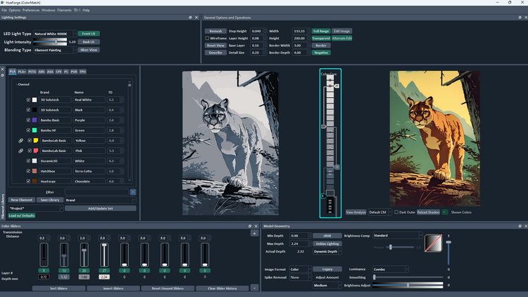
Just to prove the point, let’s try to color the picture in Standard mode. The major color scheme appears to be brown (which lands in the red spectrum), yellow and green.
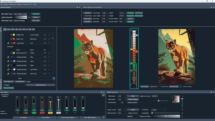
Clearly, the colors are not working. The cat’s nose, paw and ears and other places are not supposed to be green! This is what frustrates most first-time users when trying to add color to a HueForge design. Since it works primarily with the luminance (i.e. light intensity) of the image, areas with the same level of light are rendered as the same color in Standard mode, regardless of their actual color. And this is what the Color Aware Luminance mode helps to correct.
As with Color Pop mode, there is almost always a need to define the lower and upper boundaries of the color aware spectra with a black (or a dark low TD color) and a white filament, respectively. In this case, since there is little, if any, blue in the image, it might be best to try defining the color space with just red and green domains.
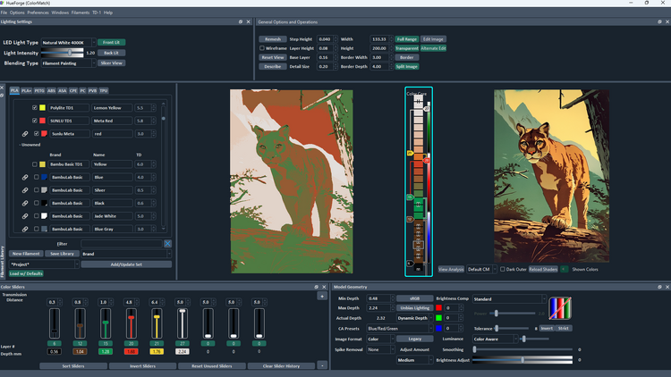
Don’t be surprised at how bad it looks when selecting the Color Aware mode. That is because the sliders need major adjustment to conform to the new settings. It’s going to look something like this:
Because the image contains mostly brown/red and green hues, the CA Presets is best changed as well to Red/Green. Then it should look like this:
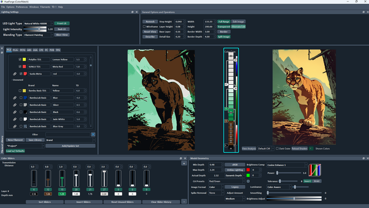
There is a choice of how to proceed. One possibility is to replicate the default black and white colors onto additional sliders. This is easily done by clicking on the color box below the slider and dragging it to an unused slider. These new colors are used to define the added luminance regions of the design. The Color Core (circled in red) shows the color blending of the layers on the left and the extent of each color space on the right.
- Note that the Color Core in version 0.8 is substantially enhanced from that of previous versions. The tags to the side of the core are equivalent to the sliders and can be used to change the layer by holding and moving them. In addition, filaments can be dragged from the library to the core. Pressing the space bar when hovering the cursor over these tags acts to disable the filament in the same way as clicking on the layer number box below the color's slider.
However, HueForge provides an alternate approach that might simplify this step through a predefined Color Aware set of filaments/colors. It’s found in the pull-down menu (circled in yellow below) near the bottom of the filament library window, normally found at the left side of the HueForge window.
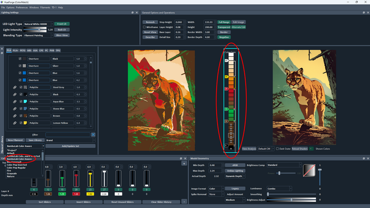
If the premade Color Aware set of filaments is chosen it loads the extra black and white filaments at the appropriate layers for three colors as well as a blue, a red and a green filament near the midpoint of their respective ranges. When selected, the image will look something like this.
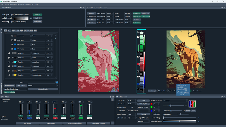
To limit it to just the red and green color domains, the sliders for the extra color domain need to be disabled and the levels of the remaining colors adjusted to more appropriate levels. However, be warned things will look much worse until all the adjustments are completed.
After selecting the color aware premade filament set, change the CA Presets in the Model Geometry section to Red/Green. Then disable the second, third and fourth sliders (blue, white and black) and adjust the other silders to put the white at the top of the red domain just below the first black marker on the bar on the right side of the color core and the red filament slider to about midway between the lowest black and the first white. It should look something like this.
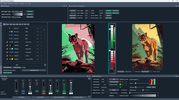
With those in place add brown and yellow filaments to replace the blue and first white in the second and third sliders. With some tweaking (and reordering the sliders), it should now be possible to arrive at something like this:
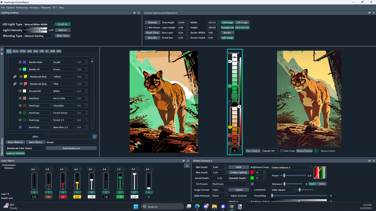
That’s not bad! All the colors seem to be pretty much in the right places. From here it should be a matter of small adjustments to refine the design to suit your taste.
Note how the Color Core has two regions, the left part shows the color blending by layer and the thinner right part does not change with the movement of the sliders and is a representation of the extent of each color domain. In this example, there are just red and green because of the CA Preset that was selected earlier. That right part does change to match the CA Preset selected and expands or contracts with changes in the Power setting (below the Brightness Compensation control). If either of these is adjusted, the color domain boundaries probably need to be adjusted as well by moving the lower white and upper black/dark sliders to get the boundaries of the left part to match the right part of the color core.
To make it easier, press the Reorder Sliders button to sort the sliders into ascending order from left to right. Then maybe try changing the layer height to 0.04 mm to allow better control of the color blending and fine tune each of the colors.
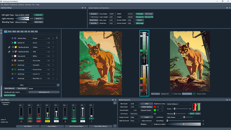
That is looking pretty good. One last note is that the Tolerance is reduced here from the default setting of 8 to down to 1 to get some of the greens to fill the right spaces. However, it might be a matter of taste where that particular control gets set, though in most cases lower is better.
One final note, check which filaments were loaded with the preloaded set earlier as they are likely to include one or more that are not in your owned library of filaments. If so, replace them with filaments of the nearest color and TD value and make adjustments as necessary to correct any changes that might result.
As a final check, let’s compare this result to the one included with HueForge.
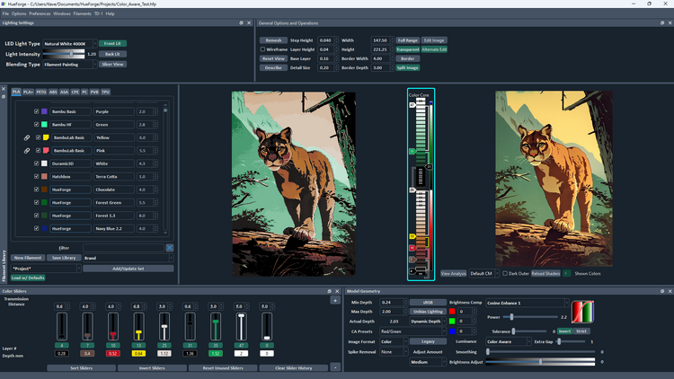
Clearly there are some differences in the appearance, the most notable being that shadows are a bit better defined in this example. It is also noted that the filaments specified are different between the two. However, the important point is that the colors and TD values are very similar. Using different filaments, e.g. the ones you own, can sometimes alter the result noticeably, but this difference is minimized by selecting similar colors and TD values. In fact, the TD values are more important than the color match. The color match, or lack thereof, can often be overcome by adjusting the sliders a bit.
Another difference, which doesn’t affect the rendering is the Min Depth and Max Depth settings. The Min Depth setting, which is the thickness of the layers under the geometry model, is only 0.28 mm in the HueForge example file, while the default depth used here was 0.48 mm. However, because the part of the model that matters is exactly the same depth (i.e. 1.76 mm) in both cases, the only difference in the result is that the version presented here would be a bit stiffer than the example file when printed.
What remains might be to refine the color setting a bit to better match your personal interpretation of the model. After all, it’s more important for you to be pleased with the result, regardless of how well it matches someone else’s rendering, even if it’s the one provided by the HueForge creator (who is not me, BTW).
The important thing is that you should now have a workflow that can get you reasonable results without the frustration of colors bleeding into areas where they don’t belong. Time to load up an image you’ve never been able to master and try again. While not perfect, Color Aware should help you realize better HueForge results with more colorful images.