New Color Match Page
Video Work Along Tutorials (0.9+)
Thanks to Danny at NeoKoi Prints for these Color Match Crash Course videos:
What is Color Match?
Color Match is a Mesh Mode (formerly called a luminance mode) introduced in version 0.8.0 and updated in version 0.9.x. It is a mode that greatly differs from the usual operations of other HueForge mesh modes. Instead of the source image creating a mesh from the image intensity (luminance), in Color Match mode, the colors you select by dragging from the image onto the Mesh Core creates the mesh. The Mesh Core defines on what layer a color will be put. If you want red in the background, you put it at or near the bottom, if you want blue, you put it there, etc. That is, this mode matches a color to a layer, rather than to a luminance value.
Understanding the Color Core and the Mesh Core
One of the biggest differences in this mode is that there are two cores between the image and preview panes. The one to the left is the standard Color Core, while there is an added Mesh Core to its right with a number of controls between the two. Learning the purpose and operation of the Mesh Core is fundamental to using the Color Match mode successfully. Making full use of this mode takes some practice but once grasped it opens up a whole realm of possibilities the other modes cannot match.

Most of the controls that were in docks in previous versions of HueForge are now housed in toolbars at the top or bottom of the version 0.9+ application window. Likewise, Color Match is initiated from the appropriate toolbar by selecting that option from the Mesh Mode drop-down menu.

Mesh Core
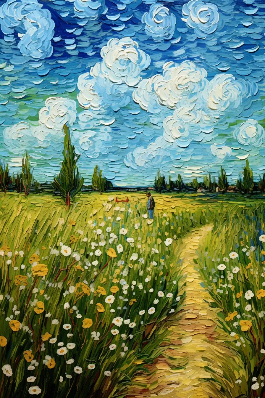
After loading your image, assembling colors on the Mesh Core is the essential first step in the Color Match workflow. For the purpose of illustration, let's start with an image that would be nearly impossible to render satisfactorily in any of the other Mesh Modes, that is the image from the "Van Gogh Style Field.hfp" example in the HueForge/Tools folder.

Click this link to access the example image and download or drag it into HueForge: Media: Van Gogh Style Field.webp
(Note: This image is from the HueForge/Tools project by that name but would need to be exported from it since all the example projects store their images internal to the project file.)

Colors from the image can be Ctrl-dragged (Cmd-drag release Cmd in MacOS) using the cursor from the image onto the Mesh Core. Filaments can also be dragged from the library to the Mesh Core, though some image derived colors help to improve the blending of gradients of color in the final model. When active (surrounded be a light blue box), the image preview on the left reflects the model mesh as defined by the Mesh Core.
Colors derived from the source image and placed on the Mesh Core are blended in the same manner as they would if they were "real" filaments. Then the program seeks to match the resulting spectrum of colors to the filament colors that you add to the Color Core later in the workflow (or sliders, if using, though the sliders are not fundamental in versions going forward).
The mesh core allows you to build the filament painting's mesh by picking colors and placing them on the Mesh Core (or the sliders). Colors placed on the lower layers of the mesh core will be laid down first (for example, the background of an image) and then build its way upwards as you add colors to the Mesh Core.
To further illustrate this process, the image, taken from the HueForge/Projects folder is shown here with black and white filaments (at the top and bottom, designated with five sided outlines) and six image derived colors on the Mesh Core (designated by six sided outlines). It is meant to show a Mesh Core as one might begin to define the color layers there. Note that the preview image on the left is only a representation of the image resulting from the "fake" filaments shown. A preview of the likely print results is developed in the Color Core part of the workflow that follows.

An important distinction to note is that the TD values of an image derived color is 1 by default. It is very often useful to adjust his value to better match actual filaments to be applied to the Color Core later in the process. Specifically, the example shown above is shown below with the TD values, revealed by pressing the green TD button (toggles) to the left of the Mesh Core near its bottom, as they might have been assigned to help improve the preview image.

Though there are clearly some shortcomings at this point in the development, such as the miscolored flowers and clouds and some missing reddish-brown details, this example illustrates the basic function of the Mesh Core.
Once the Mesh Core preview is satisfactory, operation switches to the Color Core.
Color Core
The next step in the process after setting up the Mech Core is to move to the Color Core, by clicking on it or by pressing the green arrow button at the bottom between the two cores. Do not be surprised by the preview that results, as it is likely to be in grayscale, since it only has your default filament set on it at this point.

The next step is to select filament colors that match or approximate the corresponding colors found on the Mesh Core. They can come directly from your Owned library filaments by dragging to the color core, as with other modes. Or they can be matched to the colors previously placed on the Mesh Core by right-clicking on the filament flag (or a two-finger press on a track pad or an Apple mouse) and selecting Find Closest Filament. This sorts the filament Owned and Unowned library lists putting the best matching colors at the top of each list. Colors on the image can also be used in much the same manner by right-clicking at a location on the image.
The preview image on the left will not change to reflect the selected colors until the color core is selected by clicking on it or using the arrow control button at the bottom right of the core. It is not entirely bad to wait to do this until all or most of the first set of colors are in place on the core, because the image will become falsely colored with each partial set of colors. This can be downright scary to watch. For example, this is what it would look like if the first dark blue filament selection was used to replace the first default gray filament

Delaying the selection until an initial set of the colors is in place results in a more pleasing first impression of the print preview that results. For example, it might look something like this with seven filaments placed in appropriate places on the Color Core.

While it is not perfect, this is a good start. Not too bad for just seven filament colors. It needs a reddish-brown, some work on the colors in the clouds, and refinement of the greens and yellows. Accomplishing this might require an increase in the Blend Depth and/or reduction of the layer height to accommodate more colors.
Here is an attempt with just seven filament colors with 0.04 mm layer heights. Note that this also employes the Bright Enhance 1 Brightness Compensation with a weighting of 1.4 as well as the Fast Spike Removal. To limit the number of different filaments the white was reused to provide lighter versions of several colors. Using a yellow in multiple places can also help to blend greens into lime colors and reds into oranges. This approach widens the color pallet available from a limited number of filaments

So, is this an exact replication of the original image? Obviously not. But at some point in the development, it might be best to stop looking at the original and just decide whether the preview represents the print you would be pleased to have.
Final Tips and Techniques
- While doing the final editing it is often useful to add a filament just to see how it works in the composition. In the event it doesn't work, the filament can be disabled by hovering over its flag on the Color Core and pressing the spacebar or right-click and select the Disable or Delete Slider option. Hitting the delete key also works to delete the filament. The disable function can be toggled on and off by pressing the spacebar to allow easy comparison.
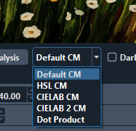
- The Matching algorithm is adjustable at the bottom of the image pain. It is initially in the Default CM setting. Other selections are as shown. It is useful to try the options reasonably early in development to determine which is best for your particular image.
- Images with soft gradient colors benefit a lot by putting more colors off of the image on the Mesh Core.
- When working on the Color Core, after setting up the Mesh Core, lay out the filaments in ways that approximates the spectrum of colors on the Mesh Core. In doing that, remember it is possible to blend a white over a primary color to blend toward a pastel color. This can help limit the number of filaments needed and greatly expand the pallet of colors available.
- Vertical equal signs in a core means that color is saturate at that layer. If it is in the Mesh Core, that layer will not be used to match colors in the preview. If it is in the Color Core, the blending of that color is not changed and if it is in the uppermost layer HueForge will truncate the model at the last unsaturated layer.
