Color Pop
Video Tutorials
HueForge Color Pop Video tutorial
NeoKoi Prints Color Pop Video tutorial
How to Use Color Pop Luminance Mode
Note: This article was composed using HueForge version 0.7+. With the release of version 0.8 the user interface has changed, but the fundamental techniques have not.
Pictures with one region of color over a monochrome background benefit from the Color Pop mode. This mode stacks two color spectra one on top of the other. It puts the background of the image on the bottom of the print and the colored part above the background.
The original version of HueForge required breaking the image in a photo editor into separate images that were then joined after printing to accomplish this. This newer mode merges the process into one workflow within HueForge. Think of it as stacking two HueForged designs on top of each other.
A good way to learn this mode is to start with one of the premade examples provided in the HueForge/Projects folder. But rather than load the project, try loading the image used in the project with just the default settings. For example, load the parrot-color-pop.png file from the Projects folder.
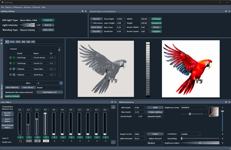
Once loaded, after selecting the Color Pop Luminance mode there is a choice of how to proceed. One possibility is to duplicate the default black and white colors onto additional sliders. This is easily done by clicking on the color box below the slider and dragging it to an unused slider. These two new colors are used to define the two luminance regions of the design.
However, HueForge has provided an alternate approach that simplifies this step through a predefined Color Pop set of filaments/colors. It’s found in the pull-down menu near the bottom of the filament library window, normally found at the left side of the HueForge window.
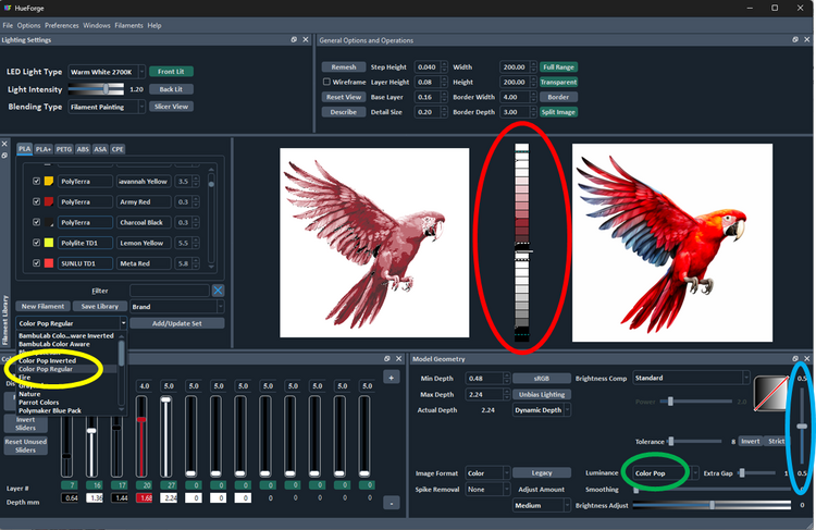
Selecting this item (circled in yellow) loads a new set of filaments, which includes the needed second black and white filaments and positions them within the two color domains in the appropriate layers. It also adds a red filament, which is somewhat arbitrary, but which works here.
The colors make sense, but the actual filaments in the premade set of filaments might very well differ from ones you have on hand. It is probably advisable to replace them now by dragging versions from your Owned library to the corresponding slider. Use the filaments that have the nearest matching colors and transmission distances (TD).
The 0.7.0+ version of HueForge has added a Color Core bar (circled in red) between the two images (original, on the right, and as rendered, on the left). It shows the color and its blending at each layer. In Color Pop mode (circled in green), the Color Core also shows the point of separation between the two (upper and lower) luminance regions by a solid line and two dashed lines separated by a gap.
Moving the Weighting bar (circled in blue) in the Model Geometry panel moves this separation up and down. To start, this control is best set to mid-range, if it is not there by default. This acts to proportion the two luminance spaces within the total height of the design. It might be necessary to vary this later as the design is refined.
If you don’t load the premade filament set, the added black and white colors would need adjustment. While observing the colors in the Color Core, move the new black slider until its color appears just above the mid-point of the core (solid line) and then the white slider to just below the black layer on the Color Core. Note that the two default grays would also need to be disabled by clicking the layer number box below each slider. You would also need to add a red and a yellow filament to unused sliders. If you did use the premade filament set the red is already loaded, but a yellow would need to be added.
Now we can start coloring the bird by adjusting the red and the yellow filament by running their sliders up to layers in the upper half of the color core. Also, to get the gray-blue coloring on the lower wing feathers those colors can be added to sliders and adjusted into the color domain below the solid bar in the Color Core.
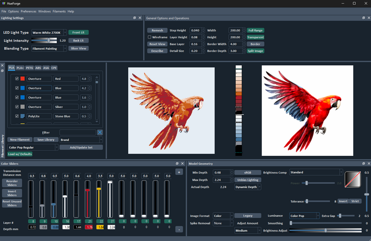
Notice that though the parrot is now red with some yellow highlights, the gray feathers on the lower side of the wing are still red and not gray-blue as it is in the original image. The solution to this problem is to adjust the Model Geometry Tolerance value higher by moving the control to the right. This expands the range of colors that are considered to belong in the lower, “gray”, spectrum.
The sliders have been reordered by pressing the Reorder Shaders button to make them more intuitive to view. Doing this often helps to keep the positioning of the slider layer heights correct relative to the others.
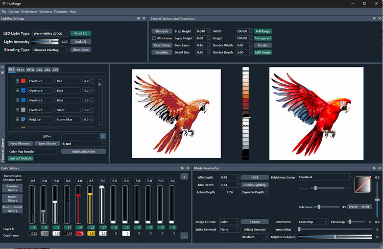
The tolerance is now set to 45 and this has corrected the lower wing feather coloring. Normally this is set at 8 by default and in general values under 20 are advisable, but sometimes the image needs it to be set higher, as in this case. The rule of thumb is to set it as low as possible to get reasonable results.
Now that the colors are generally in the right place, it’s time to experiment with different filaments to fine tune the design. This is where artistic license and personal taste enter the picture. For example, though the bird is now red as it should be, that tone of red is a bit muted. It would be nice to brighten up the design. Dialing back the second black might help some, but then the shadow details disappear.
So maybe a different red would help or maybe an additional red, one with a lower TD to make the red “pop” more, say a Polylite Army Red to the upper half of the color core. (Don’t own it, don’t worry, it’s ok to just find it in the Unowned library by setting the filter to Army and try it out.) And maybe add a blue, like Polylite Stone Blue, to the lower half of the color core as well to better represent the lower wing feathers. And while you’re at it, what would happen if you took the layer height down from the default 0.08 mm to 0.04 mm to give more control over how the filament colors blend.
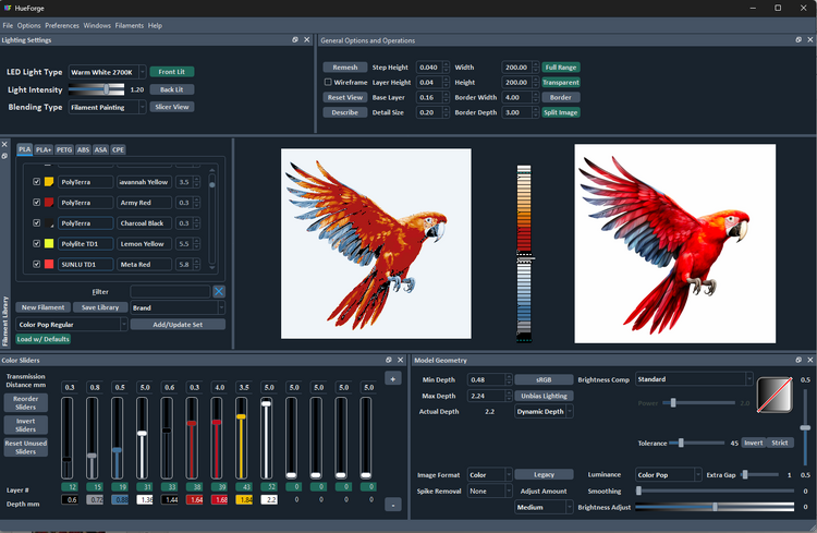
So, there it is, it’s getting close to the original image at the right. From here it’s just a matter of small adjustments to refine the design to suit your taste and hardware situation. Maybe you’re doing color swaps on a single-color machine, so that one filament of either the gray or the Steel Blue (and maybe only one red) will do to reduce the number of swaps. Or you don’t own the Army Red and don’t choose to buy it right now.
It might be a good time to see exactly how close this is to the example project as provided with HueForge.
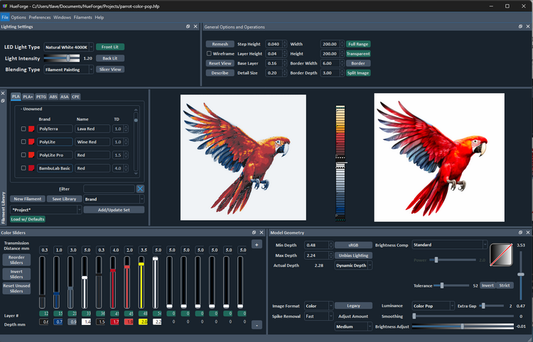
It’s not identical, but close. Could it be made identical? Of course it could, but why worry about it? There really is no “perfect” result. Or rather, perfect is when you are satisfied with the result.
What is important about this comparison is that it shows you have an application workflow that gets you to a reasonable result. A result that is every bit as good as the one HueForge provided. Now, go load up one of your images that could benefit from Color Pop!